


Most church directions pages stop at an embedded map and a street address. That may be enough for someone who already knows the campus, but it often leaves first-time guests guessing.
New visitors are not only asking, "Where is the building?" They are also asking, "Where do I park? Which door do I use? How early should I arrive? Will I feel lost when I get there?" A stronger directions page answers those questions before Sunday morning.
Define the real job of the directions page
A directions page is not just a location utility. It is part of the visitor pathway. The page should help someone move from interest to arrival with as little uncertainty as possible.
That means the page needs to do more than display a map. It should explain the last few decisions a guest makes before walking inside: which driveway to use, where to park, which entrance is best for families, and what to do if they arrive late. These details may feel obvious to members, but they are not obvious to someone visiting for the first time.
This is the same principle behind a strong digital welcome. A church website should reduce anxiety before the visit, which is why the practical ideas in church website must-haves for new visitors also apply to directions. The goal is clarity, not cleverness.
Start with address, map, and local search basics
The address still matters. Put the full physical address near the top of the page in plain text, not only inside an image or map embed. Search engines, map apps, and assistive technologies need readable information.
Use a clean embedded map, but do not rely on it alone. Some people will open the page on a phone in the car. Others will copy the address into their preferred navigation app. A simple "Open in Google Maps" link can help, but the surrounding instructions matter just as much.
Make sure the address matches the church's Google Business Profile, footer, contact page, and any local directory listings. Conflicting addresses create trust problems and can weaken local search signals. If the church has offices at one location and worship at another, label that difference clearly.
This connects directly to local discovery. A well-maintained Google Business Profile helps people find the church, while the church website helps them understand what to do next. The two should support each other, as covered in Google Business Profile for churches.
Explain parking like someone has never been there
Parking is one of the most common sources of first-visit friction. Members know the normal flow. Guests do not. If the parking lot has multiple entrances, shared spaces, street parking, overflow lots, or special areas for families, explain them in plain language.
A useful parking section can answer:
- Which lot should guests use first?
- Is there visitor parking near the main entrance?
- Where should families with children park?
- Is overflow parking available for busy Sundays?
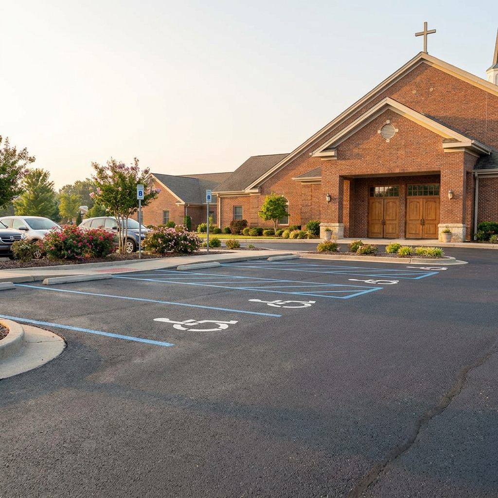
- Are there accessible parking spaces near the right entrance?
Do not write this like a legal notice. Write it like a calm person giving directions: "Most guests park in the lot off Oak Street. If that lot is full, volunteers will direct you to overflow parking behind the fellowship hall."
If the campus is confusing, consider adding one simple image. A photo of the actual entrance or parking area is often more helpful than a polished stock photo. Avoid adding a detailed map graphic unless someone will keep it current. Outdated parking maps cause more confusion than no map at all.
Make entrances and next steps unmistakable
Many churches have more than one door. Some doors are locked during service. Some lead to offices, classrooms, or older parts of the building. A first-time guest should not have to guess which door is meant for them.
Name the main entrance in simple terms. If the church uses signs on campus, match the language on the website to the language people will see when they arrive. If the "Welcome Center Entrance" is the right door, say that. If families should use the children's check-in entrance, explain why.
This is especially important for churches with children's ministry. Parents want to know where to go, whether check-in happens before or after entering the main building, and whether someone will help them. A directions page does not need to repeat every ministry detail, but it should point families to the right first step.
Questions like these often belong in a broader first-visit FAQ too. When directions, parking, children's check-in, and service expectations are spread across unrelated pages, guests have to piece the answer together. The approach in using FAQ sections to remove hesitation before Sunday can help churches group those answers in a more useful way.
Include accessibility and arrival details
Accessibility information should be easy to find. If accessible parking is near a specific entrance, say so. If ramps, elevators, assisted listening devices, wheelchair seating, or accessible restrooms are available, list the practical details without overexplaining.
Also account for common timing questions. Tell guests when most people arrive, where coffee or welcome areas are located, and what to do if they arrive after the service starts. These details are small, but they reduce the feeling of being exposed or out of place.
A clear directions page can also support volunteers. Greeters and parking teams can point people to one accurate page instead of answering the same logistical questions in different ways. When the page is accurate, the whole arrival experience becomes more consistent.
Review the page after any campus change. Construction, a new children's wing, a changed traffic pattern, or a moved welcome desk can make old directions wrong overnight. Directions pages should be part of the church's regular website review, not a page that gets published once and forgotten.
Build the page with a simple structure
A strong directions page does not need to be long. It needs to be organized. The best structure usually looks like this:
- Address and map: Full physical address, embedded map, and navigation link.
- Parking: Best lot for guests, overflow instructions, and accessible parking.
- Entrances: Which door to use for worship, families, offices, or weekday events.
- Arrival expectations: When to arrive, where to go first, and who can help.
- Accessibility notes: Ramps, elevators, seating, restrooms, and assistance options.
- Contact fallback: A phone number or contact form for unusual questions.
Use headings that match what people are trying to find. "Parking" is better than "Campus Information." "Which entrance should I use?" is better than "Arrival Logistics." Plain labels help guests scan quickly, especially on mobile.
Before publishing, ask someone who does not attend the church to read the page and describe how they would arrive. If they can explain where to park and which door to use, the page is doing its job. If they still have basic questions, the page needs another pass.
A good directions page is not about adding more content to the website. It is about removing avoidable uncertainty. When guests can find the building, park easily, and walk through the right door without feeling lost, the church has already started showing hospitality before anyone says hello.
If your church website needs clearer visitor paths, parking details, or first-step pages, Red Letter Connect can help organize the structure so guests can find their way with confidence.