


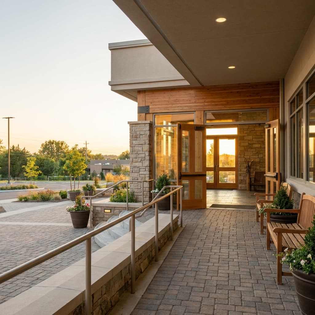
A church website can be clear, attractive, and still quietly difficult for some people to use. If a guest cannot read the text, move through the menu with a keyboard, understand a photo-heavy page, or find basic accessibility details before Sunday, the barrier is digital before it is physical.
Website accessibility is not just a compliance topic. It is part of hospitality. The goal is simple: help more people understand where to go, what to expect, and whether your church has thought about their needs before they arrive.
Accessibility starts with clarity, not code
Many churches hear the word accessibility and jump straight to technical checklists. Those matter, but the first question is simpler: can a visitor get the information they need without working hard?
Start with the pages that shape a first visit. Service times, location, parking, entrances, children's ministry, livestream, and contact information should be easy to find from the home page. If someone is using a screen reader, zooming the page, reading on a phone in bright sunlight, or helping a family member plan ahead, hidden details create friction fast.
This connects closely with the broader idea of a church website as a digital front door. A strong digital welcome mat for church visitors gives people confidence before they ever walk into the building. Accessibility sharpens that welcome by making sure the information works for people with different abilities, devices, and levels of comfort.
Make the page usable for people who do not browse the way you do
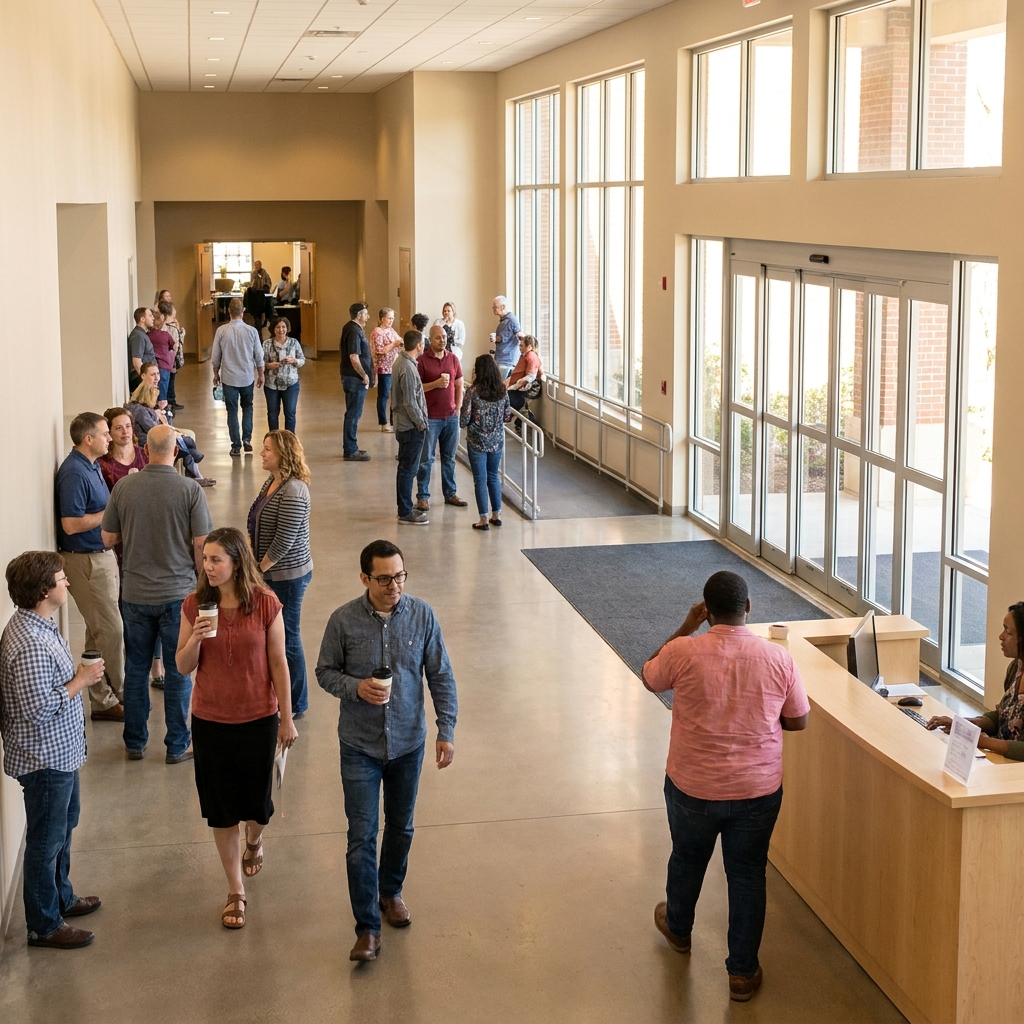
Church staff often review a website on a laptop, with good eyesight, a fast connection, and full familiarity with the building. Many guests do not have that advantage. Some use screen readers. Some enlarge text. Some cannot use a mouse. Some process information better when it is broken into short sections.
A few practical checks reveal a lot:
- Can you move through the page using only the Tab key?
- Does every button and link have a clear label?
- Does the page still make sense when images do not load?
- Can text be zoomed without overlapping or disappearing?
- Is the color contrast strong enough to read comfortably?
- Are headings in a logical order, so a screen reader user can scan the page?
These checks are not only for people with permanent disabilities. They help older adults, parents holding a child, people with temporary injuries, visitors with slow phones, and anyone trying to find information quickly. Accessibility usually makes the site better for everyone.
Use plain language for physical accessibility details
Visitors with mobility needs often want direct answers before they decide whether to attend. Is there accessible parking? Which entrance has a ramp or no steps? Are there elevators? Where should someone sit if they need extra room? Is there a quiet space or sensory-friendly area? Who can they contact with questions?
Do not bury this information in a PDF, a bulletin image, or a vague paragraph. Put it in plain text on the page. Use specific wording. "Accessible parking is available on the east side of the building near Entrance B" is much more helpful than "parking is available."
The same principle applies to any page where visitors may feel uncertain. If your FAQ page answers common Sunday questions, include accessibility questions there too. A thoughtful church FAQ section that removes visitor hesitation can make the difference between someone wondering silently and someone feeling prepared enough to come.
Images need context, not decoration alone
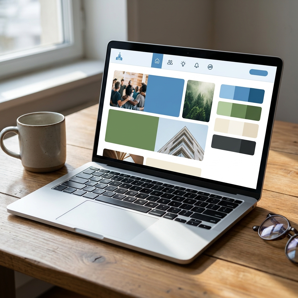
Church websites often depend on photos to communicate warmth. That is good, but images need support. A screen reader cannot describe a photo unless the site provides meaningful alt text. A visitor who cannot see the image should still understand why it matters.
Good alt text is brief and useful. If the image shows the main entrance, describe the entrance. If it shows a family check-in area, say that. If it is only decorative, it can be marked as decorative so it does not clutter the experience. The mistake is leaving every image as a filename, or using vague labels like "church photo."
Videos need the same care. Sermon clips, welcome videos, and announcement videos should have captions when possible. Captions help deaf and hard-of-hearing visitors, but they also help people watching without sound or trying to understand a speaker in a noisy room.
Build accessibility into routine website maintenance
Accessibility is not a one-time project. Church websites change constantly. New event pages get added. Staff upload flyers. Service times shift. Ministries add registration forms. Each change can either keep the site usable or add a new roadblock.
A simple monthly review helps. Open the most important visitor pages, test them on a phone, tab through the links, check that images have useful alt text, and confirm that contact forms are easy to complete. This fits naturally into a broader monthly church website maintenance checklist, because broken links and inaccessible content usually show up in the same places.
Pay special attention to flyers. A graphic with all the event details may look nice on social media, but it is often hard to read, impossible for screen readers to interpret, and frustrating on mobile. If you use a graphic, place the key details in regular text on the page too.
Give visitors a person to contact
Even a well-built page will not answer every situation. Some visitors need to ask a specific question about seating, sensory needs, transportation, interpreters, or mobility support. Make that next step easy.
Use a clear contact option near accessibility information. It can be a general office email, a ministry contact, or a simple form. The important part is that it feels safe and normal to ask. Visitors should not feel like they are creating an inconvenience by needing details.
This is where digital hospitality becomes real hospitality. The website cannot replace people, but it can lower the emotional cost of reaching out.
A practical accessibility checklist for church leaders
If you want a starting point, review your site through these questions:
- Can a first-time guest find service times, location, parking, and entrance details in under one minute?
- Does the site explain accessible parking, entrances, elevators, seating, and restrooms where relevant?
- Can the main pages be used with a keyboard?
- Are link labels descriptive, instead of "click here" repeated across the page?
- Do important images have useful alt text?
- Are videos captioned when they communicate important information?
- Is event information written in text, not only inside graphics?
- Do forms have clear labels and simple error messages?
- Is there an easy way to ask accessibility-related questions?
You do not have to fix everything in a week. Start with the pages that matter most to guests. Then make accessibility part of how your team publishes anything new.
When your church removes digital roadblocks, you are not just improving a website. You are telling visitors, "We thought about you before you got here." If your team wants help reviewing the parts of your website that shape a first visit, Red Letter Connect can help you think through the next right improvements.